Blog/The world is getting less colourful. We need to change that
17th August 2022
This week I stumbled across a wonderful Twitter thread by The Cultural Tutor (@culturaltutor) who has completed a wide and varied investigation into colour in the world via a number of creative and interesting methods and has arrived at the conclusion that the world is becoming less colourful.
The Cultural Tutor’s research takes into account such things as the colour of all cars sold globally in any given year, the most popular household paint colours over time, and the colour of all clothes sold, and there is a clear trend towards a more muted, and much less colourful approach to each of them.
Think about your living room in the 1980s or 1990s (or even earlier if you’re of that vintage!). What colour was your carpet? And your wallpaper? What were you wearing in said living room? I’m guessing it’s a full spectrum of colour! I know my living room growing up had a green carpet, and our wallpaper featured pink flowers with little blue hummingbirds on it, & the lamp on top of our HUGE CRT TV had a pink, blue and green shade to bring the whole room together. And bring it together it did!
We had a bright blue car that I used to zip around in in my quintessentially 90s fashions, the colours on which would make people stop and point today. Because nowadays, the garish (by today’s standards) colours have been replaced almost entirely.
Our living room today has a stained wooden floor. Our walls are ‘Confused otter’ or ‘Naked pensioner’ or something like it with as fanciful a name, but practically bereft of colour. Our car is dark grey. My wardrobe is entirely dark blue or brown. Look around you. Even branding – designed to peak your attention – is becoming more muted (perhaps to reflect the changing attitudes towards gratuity and indulgence) and monotone.
It’s like, as a society, we found out that we could make things any colour we wanted in the 20th century, went to town on it in the ensuing decades, and now we’ve had our fill, and we’re scaling it right back.
And this is reflected in the most holistic of all TCT’s analysis, which is of the colour of pixels across all photos. Essentially, a reflection of everything in photos/pretty much everything that exists:
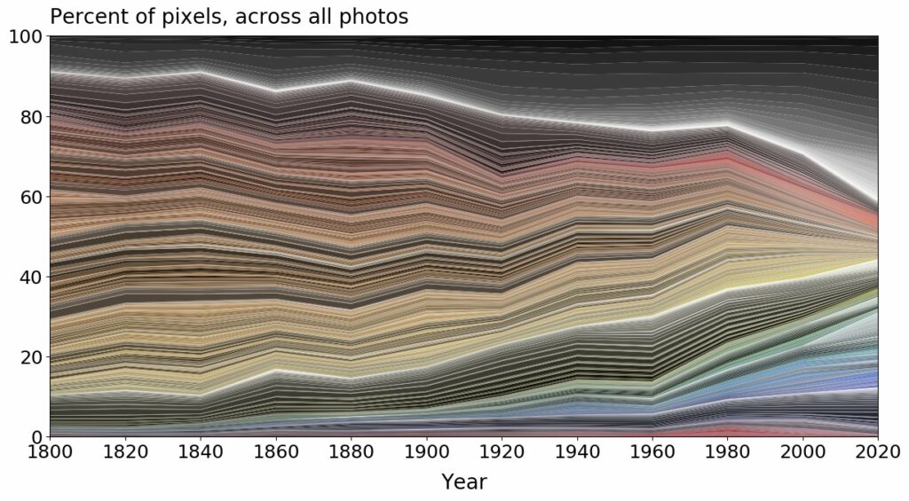
Putting to one side the questions around how anyone was able to measure this pre the invention of colour photography (the early 1900s), it’s a pretty obvious trend away from ‘colourfulness’!
And that’s a shame. We need colour in our lives. It adds depth, and life. While I’m all for all things natural and organic, and what it represents in society, let’s not pursue earth tones and hessians to the detriment of the joie-de-vivre that comes with a full colour palette!
Take without doubt the most joyous people in our society: namely toddlers. Look in their rooms and their nurseries and their schools and their outfits and toys. It’s a world of colour. And look how happy they are! Let’s give ourselves some of that.
Maddison Creative is a web design studio based in Newcastle upon Tyne in North East England. Get in touch to find out what we can do for your business branding and online presence today.